COLOUR WITH CLAIRE
  • ~Home~
  • ~My Story~
  • ~Mental Health~
  • ~Beginner's Guide to Colouring~
  • ~Tutorials~
  • ~Colouring Book Reviews~
  • ~Product Reviews~
  • ~Arts & Crafts Reviews~
  • ~Gallery~
  • ~Colouring Challenges~
  • ~Gemstones~
  • ~Charts~
  • ~Digital Painting~
  • ~Illustrator Interviews~
  • ~Media Appearances~
  • ~FAQ~
  • ~Contact~
  • ~Policy~
  • Palette generator

Prismacolor / Polychromos Colour Comparison Chart

15/5/2017

38 Comments

 
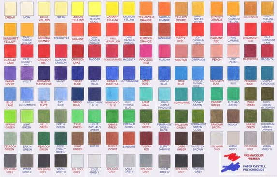
I own both the 120 set of Faber Castell Polychromos and the 150 set of Prismacolor Premier, and I've often wondered what a colour comparison chart would look like across both sets of pencils- so I decided to make my own! Obviously as there are 30 more Prismas than Polys there are some colours which cannot be matched between sets, but I have done my very best to match up as many as possible, as closely as I can. I thought I would make this available to you all so that you can see at a glance which colours are similar and there's no more hunting around online for a comparison chart! This will be especially handy when you're following colour-alongs or tutorials which use one brand eg. Prismacolor and you only have Polychromos. Now you can find a similar shade!

I have scanned the page into my computer so some colours may vary from how they actually look to the eye. Some colours are not perfect matches, but they're as close as I could find. Prismacolor is in red, Polychromos in blue.

Click the image below to access the PDF file. I hope you find this helpful!

Picture
38 Comments
Leanna
15/5/2017 09:08:04 am

Is there only one page? It only give 124 colours combined.

Reply
Claire
15/5/2017 10:12:35 am

Hi Leanna, yes just one page. As I explained in the post, some colours cannot be matched as there either isn't that shade in the lesser set of Polychromos or it just doesn't closely match with anything else x

Reply
Molly
15/5/2017 09:19:51 am

Thanks for making the chart it's brilliant - how do I read the chart. For example is Kelly green a match for earth green. Sorry if this is a daft question
Thanks
Molly

Reply
Claire
15/5/2017 10:13:37 am

Hi Molly, you read the chart from left to right, so start with Cream and Ivory as a match, then Dcco Yellow and Cream, then Lemon Yellow and Light Yellow Glaze, and so on x

Reply
Sandy
15/5/2017 09:37:55 am

Awesome stuff!
Thank you so much for putting in all this work and sharing to everyone. So very generous of you Claire!
Many many thanks to you!

Reply
Véronique Gilson
15/5/2017 10:03:34 am

Hello Claire !

Thank you for giving us this great comparison chart. For sure it will be helpful! An other chart that should be very helpful is the same chart including all the "orphan" colors from both brands.

I hope you know what I mean because I know my english is horrible! 😁

I wish you a very nice coloring day😉❣️

PS: I'm also a huge fan of your YouTube channel!

Reply
Claire
15/5/2017 10:14:26 am

Hi Véronique, sorry but I'm not sure what you mean by orphan colours, are you saying the ones which cannot be matched between brands?

Reply
Kallyne
1/5/2018 01:14:11 pm

Oh yes!!! Do you have the ones which doesn't match? I have the 120 polychromos, but I wanted to buy some prismacolor. Would be great to buy extra individual and unique colours.

Joyce Preusser
15/5/2017 04:28:57 pm

Thank you for all the hard work on this. I have been searching for a good chart like this!

Reply
Nolly
15/5/2017 07:04:37 pm

Thank you so much!
I was already searching and asking for a converter like this.

Reply
Lori
15/5/2017 08:23:59 pm

Just positively awesome Claire!! I use all my color charts and this one is soo unique, I will print and put with my batch!! I find the two brands can be used together despite others are saying no because wax/oil, but I do layer both! Yes, I think Veronique does mean the colors that don't match or are left overs due to size of FC Poly only being 120. Thank you so much for this fantastic chart!!

Reply
Janet W. Long link
16/5/2017 02:44:33 am

Thank you!!

Reply
Sammie
16/5/2017 05:35:57 am

Thank you so much for this chart! Just what I was looking for. 👍🏻🍀💕🎨

Reply
Sheila
16/5/2017 02:38:50 pm

Thank you from a lazy lady who always wanted to know. I went thru the process of using business cards with all info for every set, hole punched & put on rings. Then intrest & energy petered out. So thank you for your efforts, a lot of work & I want you to know how much it is appreciated.

Reply
LaRae
20/5/2017 03:11:52 am

Thanks love it.

Reply
Doreen Neilley
19/7/2017 08:11:31 pm

Thank you! Thank you! Thank you!!!!

Reply
Bambi
20/7/2017 03:01:45 pm

Thank you so much for going to the trouble to make this. You are awesome!!!

Reply
Angela
30/7/2017 04:52:04 pm

Thank you so much.I am doing a color a long and the artist uses polychromomos and I have prismascolor this is so great

Reply
Jen McLaughlin
19/8/2017 02:41:10 pm

Thank you for taking the time to put this together. It will be very helpful. I know the time spent doing these is very consuming. So grateful to you!

Reply
Joyce Preusser
24/8/2017 02:24:45 am

Thank you, Claire! This is fabulous. LOVE your videos!

Reply
Kate
24/8/2017 02:27:09 am

Thank you, thank you, thank you for the colour chart comparison Claire!! I have looked for one for such a long time and nearly leapt out of my skin when I saw you had made one! I hope it was okay, but I shared your web page info with two of the Youtube colouring groups I am in, so others can also benefit from your hard work, giving all the credit to you when I did so. Thank you again and I love your page!

Reply
Michelle Banaszak
31/8/2017 04:40:22 pm

Awesomeness! Thank you for sharing. ...always wanted to do this. I just have trouble with backgrounds in general. Even just 3 colours, I never can get it to transition! Every bit of this video helped me!!!

Reply
Claifre
31/8/2017 04:41:39 pm

Hey Michelle, I think you commented on the wrong post but thanks so much for your message, I'm glad you liked the rainbow tutorial! xx

Reply
Wilmarí Jooste
3/9/2017 09:02:22 pm

What color in polychromos can I use in stead of the prismas putty beige?

Reply
Shawna
25/9/2017 11:53:37 pm

Thank you so much!! I've been searching for one of these! And now I will try to match up my Block Studio pencils! And then maybe my Marcos!!

Reply
Nancy
1/12/2017 02:02:37 pm

Thanks for the chart! I've been searching for something like this for awhile. I have the Faber Castell 120 color pencils, and it's a challenge to figure out the color matches to Prismacolor pencils.

Reply
Luana
3/2/2018 07:51:07 pm

Thank you for all the charts..Appreciate all the many hours you put in making these..fan on you tube...

Reply
Theresa Johnson link
10/4/2018 01:29:08 pm

I've just bought the 150 Prisma premier set and i'd like to have (or make) a chart that's big enough to see both the soft shaded and heavier darker shade in one square, with names & numbers right above the color box. Does such o chart exists?

Reply
Claire
10/4/2018 03:02:15 pm

I don't think there is x

Reply
Kim
24/4/2018 04:11:26 pm

Thank You Claire your the best

Reply
Debbie
23/5/2018 03:03:32 pm

Thank you for the color chart comparison. I just ordered the Polychromos 120 and can't wait for them to arrive. I refuse to buy Prismas because of quality issues.

Reply
Jenni
4/6/2018 11:49:32 am

Thank you so much for this Claire. I have followed so many colouring tutorials and they used Polycolors and I have Prismacolor premiers and so have been finding it hard to match the colours even though I have a 150 count set of Prisma. You have really saved me a headache and have inspired me to get back into following colouring tutorials again <3

Reply
Lisa B
8/6/2018 08:24:13 pm

Wow! This is great Claire, thank you!

Reply
Rosalie Zatser link
8/8/2018 11:31:40 pm

THankyou for your dedication to all the colorists that watch your videos and follow u in racebook.I really appreciate all your efforts and wish you always super health , happiness and good fortune for you and your loved ones /// Claire you are a very kind devoted lady who has made our life so much better and motivating . I see that you love coloring . Keep healthy and continue with your love of art ....It has been a guiding light in your life and all your dedicated followers.

Reply
Tink
2/12/2018 08:29:20 am

Thanks, just what I needed.

Reply
BethAnn McGill
6/2/2019 04:50:30 pm

Claire you truly are such an amazing and generous person. Thank you for always sharing your wealth of knowledge for all. For someone new like me it is invaluable and I will be forever grateful. You ladies I follow religiously on Instagram and YouTube don't give yourselves enough credit for your talent and generosity. It is a breath of fresh air after being so isolated for so long. I hope I can become an active and helpful member of this lovely coloring community.

Reply
Lynne
5/5/2019 08:18:54 pm

Hello Claire,
Love your videos and following your suggestions, I got a copy of the first "Colorist's Special Effects" workbook from Helen Elliston. I can finally color in a more realistic way and I'll be sure to get the second one too.

I have the complete set of Faber Castell Albrecht Dürer Watercolour Pencils (has the same colours as the Polychromos) and I was wondering if there are any blue Prismacolor pencils that you think would complement what I have. I cannot find the specific hue I think is required for the primary blue in a color wheel - there seems to always have a little too much of green- yellow - red - or something in the colours I have. I was looking at the chart but I find it hard to tell on my screen - As you have the actual pencils, I figure you would be able to let me know if there is such a Prismacolor pencil out there.
Thank you,
Lynne

Reply
Ruth C Paul
8/2/2020 07:09:00 pm

Great chart. I printed it out at 600dpi and it looks great. Will be so helpful! It took me a moment to figure out that the Prisma colors are identified with red typing below the swatch and the Polychromos are identified with blue typing. Thank you much for putting huge amounts of time into creating this chart and for be willing to share it!!!

Reply

Your comment will be posted after it is approved.


Leave a Reply.

    Picture
    Picture
    Picture
    Picture

    RSS Feed

    DMCA.com Protection Status
©Claire Eadie 2015
  • ~Home~
  • ~My Story~
  • ~Mental Health~
  • ~Beginner's Guide to Colouring~
  • ~Tutorials~
  • ~Colouring Book Reviews~
  • ~Product Reviews~
  • ~Arts & Crafts Reviews~
  • ~Gallery~
  • ~Colouring Challenges~
  • ~Gemstones~
  • ~Charts~
  • ~Digital Painting~
  • ~Illustrator Interviews~
  • ~Media Appearances~
  • ~FAQ~
  • ~Contact~
  • ~Policy~
  • Palette generator