Colour with Claire
  • ~Home~
  • ~My Story~
  • ~Mental Health~
  • ~My Illustrations~
  • ~Beginner's Guide to Colouring~
  • ~Tutorials~
  • ~Colouring Book Reviews~
  • ~Product Reviews~
  • ~Arts & Crafts Reviews~
  • ~Charts~
  • ~Gallery~
  • ~Colouring Challenges~
  • ~Gemstones~
  • ~The Color Catalog~
  • ~Illustrator Interviews~
  • ~Media Appearances~
  • ~FAQ~
  • ~Contact~
  • ~Support~
  • ~Policy~

Colouring Challenges!

8/1/2017

26 Comments

 
Picture
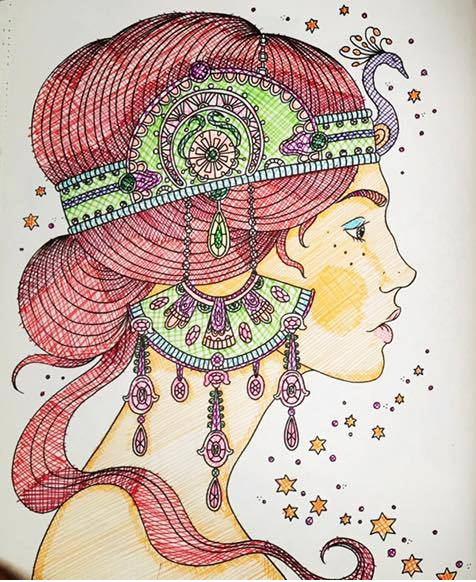
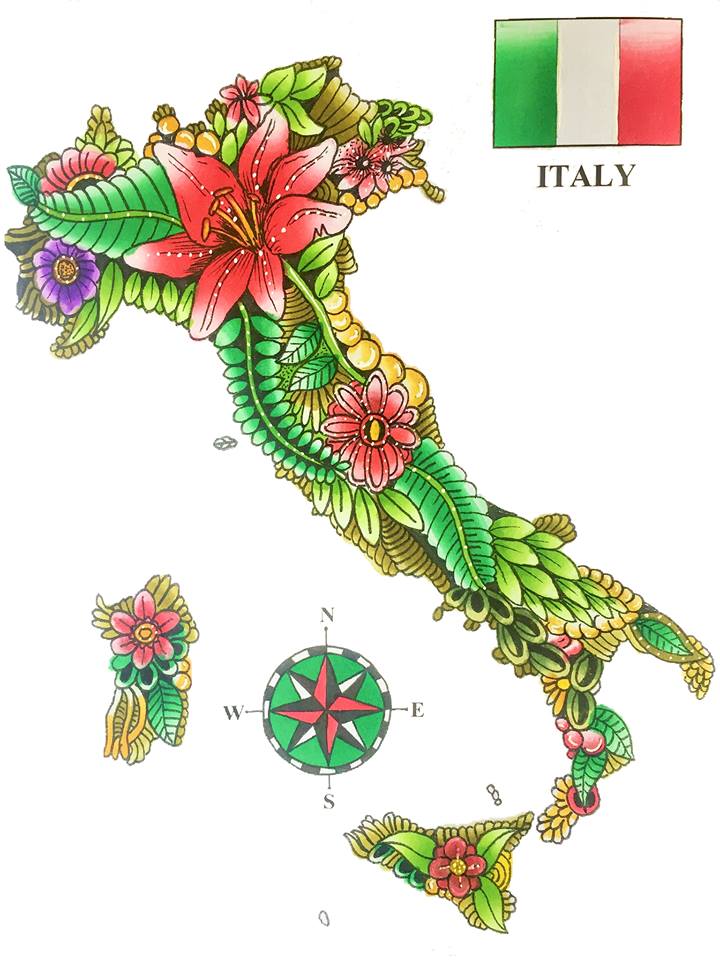
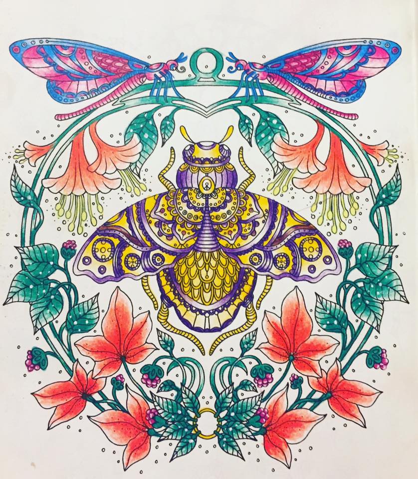
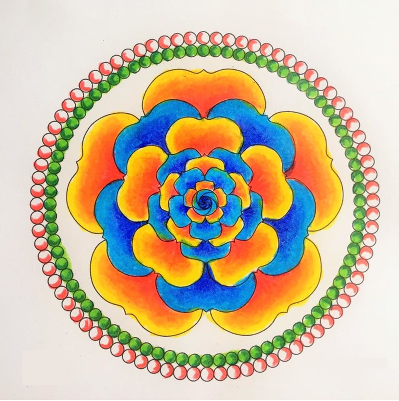
Do you often get bored of colouring in the same way and wonder about other techniques to give interest and individuality to your finished pages? Welcome to the ultimate list of colouring challenges! Here you will find an abundance of ideas to change up your colouring and try new things. Without further ado, let's get started! I will include photo examples of my own colouring where I can.

1. Sectional Colouring

Draw shapes on the illustration and only colour inside them. Alternatively, colour everything outside of the shapes in greyscale, sepia or black it out completely. You can even do a day/night contrast like I did with the owl- there is lots of ways you can use this technique. Different types of shapes, diagonal lines that alternate between colour and black & white: it's totally up to you.
Picture

2. Use only one colour family

As shown in my picture from Dagdrommar, I used only shades of green to colour the entire picture. This gives a multi-tonal effect that makes use of the spectrum of different tones you find in larger sets of pens & pencils, and also takes the often difficult decision of choosing a colour palette out of the equation.

3. Pointillism

Pointillism is the art of using dots to colour your entire picture. It sounds tedious and time-consuming, but it's actually lots of fun! The trick is to make the dots darker & denser in shaded areas, and lighter/further apart in brighter areas. As you can see, the effect works really well and gives extra texture to the illustration.
Picture
Picture

4. Crosshatching

This technique is very similar to Pointillism in that it renders your illustration rather than colours it. Draw lines over the image, making sure the lines are further apart in lighter areas and closer together in areas of shade. You can then crosshatch over the top with lines in the opposite direction, in areas which are particularly dark like the apple of my lady's cheek and the top of her hair.

5. Use flag/team colours!

This just happens to be an image of Italy that I coloured with the Italian flag colours, but you can colour any image using the colours of your country's flag. You can even Google to find out what the crest for your City looks like and use those colours. If you have a favourite sports team, use the colours of the kit or the mascot. If you want to get nostalgic, use the colours of your school uniform!
Picture
Picture

6. Blend into white

You don't always have to blend into another colour for it to look good; the white of your page can work just as well, if not better. In the image opposite, I blended each colour out into white by using lighter & lighter pressure as I came to the centre/edge of the area. This technique gives the picture gorgeous shine and really makes it pop in a metallic kind of way, particularly as seen on the bug in the middle of the page.

7. Use a limited palette

You don't always need to use every colour you have to make an illustration look good- less is sometimes more! Try working with just two colours and see what you can achieve, I often find the less colours you use, the more an image stands out.
Picture
Picture

8. Go Galaxy!

Sometimes illustrations have wide open spaces that you have no idea what to do with. Sometimes there are prompts on the page asking you to fill the linework in with doodles- but what if you can't draw like me? Add a galaxy instead! This technique is surprisingly simple and I explained it step-by-step here.

Alternatively...

9. Go Gem!

Gems look amazing! Problem is, I see a heck of a lot of comments on groups from people who feel this technique is out of their league. Believe me, it's not! It's actually fairly easy as long as you have the golden tool: a white gel pen! Here are a couple of tutorials I made: one two, and here's a really great YouTube channel which teaches you how to colour all different types of gemstones.
Picture

10. Rainbow

The colours of the rainbow look so good together because they naturally blend into one another. Change it up by using different shades of the rainbow colours, so you could use more unusual tones like pastels or neons to create a unique rainbow that is unlike the standard.

11. Add a background

A background can really set off your colouring, and there are lots of ways to achieve them but my personal favourite is chalk pastels. You can buy them cheaply from lots of art stores & online, and they provide a natural seamless blend that looks lovely and soft. PanPastels are more expensive and have brighter pigments for a bolder look.
Picture

12. Go against the norm

Green leaves? Blue sea? Pah, normal is so last year. Mix it up by using unconventional colours, making your coloured pages look magical and ethereal like you've stepped into a twilight world where nothing is as it should be.

13. Add details

If you can draw, why not add extra things into the illustrations you're colouring? Even if you can't draw, everyone can trace! All you need is a printout of what you want to add and a light underneath to make it visible through the colouring book, explained here.
Picture

14. Use a Colour Wheel

If you can never decide which colours to use or don't know which colours go together well, use a colour wheel. All you have to do is select a colour to start with and the wheel will find you several other shades which complement or contrast the first.

15. Use pre-made palettes

Design Seeds is a super useful website which has pre-made palettes for you to choose from. You can start with a certain colour, or browse their colour collections for ideas.
Picture
Other ideas I haven't yet tried are:
  • Colouring the whole picture in greyscale with only one piece in colour, eg. a grey heart with a red rose in the centre
  • Colouring lightly around the edges of the image to create a glow effect
  • Colouring a picture using every single art supply you have: paints, markers, pencils, pastels, etc.
  • Colouring a picture with ballpoint pens

I hope you've enjoyed looking through this mega post and picked up some ideas for your future colouring projects! Please tag me on Facebook/Twitter/Instagram so I can see how you've interpreted the techniques.
Picture
26 Comments
Jane
8/1/2017 02:51:17 pm

Hi Claire.

Great article.
What brand of chalk pastels do you recommend?

Thanks

Reply
Claire
8/1/2017 03:26:24 pm

I used Inscribe before I moved onto PanPastels. Mostly I use Ezyshaid pastel powders as they're quite soft & come in lots of different colours x

Reply
Megan Cowley link
8/1/2017 03:13:20 pm

Claire, this is fantastic!! What a brilliant bunch of ideas. I only have one problem.... which to try first?!?!

Reply
Wendy
8/1/2017 03:55:34 pm

Dear Claire,

Love your work, love your website and the information you share.
I'm an English teacher from the Netherlands and don't have as much time to colour and learn new techniques as I would love to. This article has given me a lot of new insights with just one click. You are awesome and please, keep sharing :-)!

Love,
Wendy

Reply
Lori
8/1/2017 05:20:09 pm

Love the ideas, especially the owl one. Would like more info on using chalk pastels. I'm afraid to try them because of the messiness.

Reply
Claire
8/1/2017 07:17:34 pm

Check out my PanPastels review, there's hardly any dust with those :)

Reply
Jenny Morgan
8/1/2017 07:13:31 pm

Thanks for your most interesting ideas. You're quite right, as much as I love colouring, I do feel sometimes I would like to try something different. I'm not very imaginative myself so your tips should get me started. Thanks, Jenny.

Reply
Karma Lewis
9/1/2017 07:03:29 am

I just love this article!!! I am bookmarking it so I can reference it later. Thank you for sharing these great ideas with us. :)

Reply
Libuška link
9/1/2017 10:01:55 am

YES! This was just what I was looking for! Thank you so much.
.... en ik lees net in de reacties terwijl ik schrijf dat je Nederlandse bent. XD. Ik ga aan de slag met je challenges.

Reply
Wendy
9/1/2017 12:10:21 pm

Heya, Claire is from the UK. Ik ben een Nederlandse :P!

Reply
Connie O'Keefe Edwards
9/1/2017 07:57:14 pm

Thank you much for this article
It's amazing, I was going thru folder last night, with all pics I've colored in 2016, and about half way through, I realized something. I'm in a rut. My cllored pics all started looking alike. I closed it uo and then decided ...going to start paying attention more to how others color and start watching fir tips. Lo and behold, checked my mail and there was your blog. Gyess it means, time for change.
Thank you for ideas and that nudge forward, I hope.

Connie

Reply
Pamela Duarte link
9/1/2017 08:31:45 pm

Great post Claire!

Reply
Mariette Swart
13/1/2017 02:38:27 pm

I tried some of your techniques and loved it. Thank you.

Reply
Maria Wedel link
26/6/2017 01:52:41 pm

Wonderful article very useful information Thank you for your great work

Reply
Sarah link
26/6/2017 11:53:35 pm

What a great way to mix things up! I love the idea of coloring a whole coloring page in a galaxy style or like a gem. These are great for people who are looking for an extra challenge!

Reply
Adrienne link
27/6/2017 01:14:19 am

Love this -- this is such a creative list of techniques, especially the sectional coloring, gems, and galaxies! Really cool to see an example or multiple examples of each one too. Great post, Claire!

Reply
Amanda Greenley
10/7/2017 09:15:46 am

Love this post. Would love to read any more of your ideas. Will be trying some of these with my Cub Scouts. Fab.

Reply
Ruby Wiens
4/9/2017 06:40:56 pm

Great post and very helpful as I'm frequently in a rut and need to move on to other methods of coloring.

Reply
Stevie
5/9/2017 06:42:58 pm

I do like the only one colour family idea.

Reply
Stevie
13/1/2018 12:42:36 pm

I like number 2. Use only one colour family idea. I'd use reds.

Reply
Lisa Burns
28/2/2018 10:54:28 pm

This is a great resource! Thank you so much for this information. Picking a color palette is really hard, and referring to all your suggestions is great! Your work is amazing! God certainly gave you a gift to share with us! As I struggle with my anxiety and grief with the recent passing of my Mother, this is surely a help to me. I thank you so much!

Reply
Claire
1/3/2018 03:54:50 pm

Hi Lisa, thanks so much for your comment. I'm so sorry to hear about your Mum :( Wishing you all the best xx

Reply
jackie aisbitt
12/4/2018 09:04:32 am

thank you claire great article

Reply
Sarah
23/7/2018 03:29:04 pm

I have no idea if it was deliberate or a happy accident, but your beetle has almost all the colours of the non-binary pride flag, and the two dragonflies above it are in trans pride colours! I love all these examples, but was particularly delighted by that!

Reply
Claire
23/7/2018 04:00:16 pm

That’s awesome! 🏳️‍🌈

Reply
Patty Tolliver
2/5/2020 05:07:21 am

Love the suggestions. Some of them I have tried and had great success. I am excited to try the other suggestions.

Thank you for sharing.

Reply

Your comment will be posted after it is approved.


Leave a Reply.

    Picture
    Picture
    Picture
    Picture

    RSS Feed

    DMCA.com Protection Status
©Claire Eadie 2015
  • ~Home~
  • ~My Story~
  • ~Mental Health~
  • ~My Illustrations~
  • ~Beginner's Guide to Colouring~
  • ~Tutorials~
  • ~Colouring Book Reviews~
  • ~Product Reviews~
  • ~Arts & Crafts Reviews~
  • ~Charts~
  • ~Gallery~
  • ~Colouring Challenges~
  • ~Gemstones~
  • ~The Color Catalog~
  • ~Illustrator Interviews~
  • ~Media Appearances~
  • ~FAQ~
  • ~Contact~
  • ~Support~
  • ~Policy~