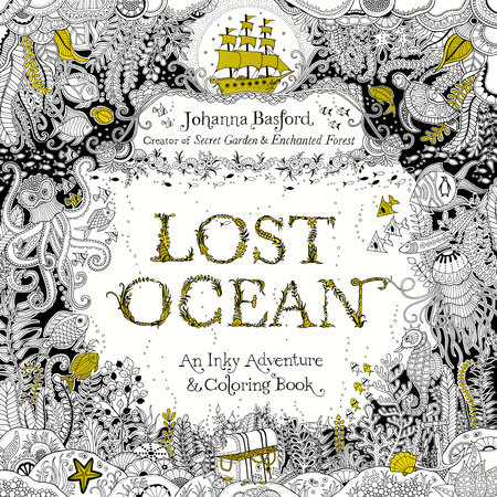
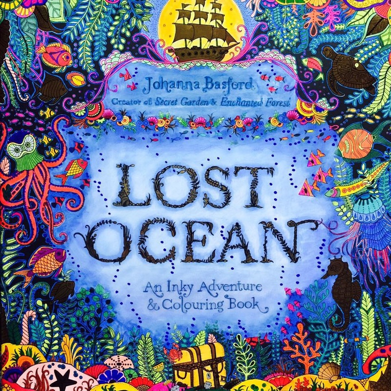
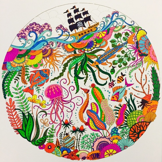
 Number of Pages: 80 Size: 25 x 25cm Paper colour: White Paper surface: Smooth Paper thickness: Good Linework: Fine Perforated: No One sided: No Binding: Glue Drawings go into the spine: Yes Waterbased pen bleed: None Here it is, the name that has been on everyone's lips since Johanna revealed it: Lost Ocean. The hotly anticipated follow up to Secret Garden and Enchanted Forest, this book has garnered turbulent reviews and seems to be either a definite like or definite dislike for most of the colouring community. I have mixed feelings as there are certain aspects of the book that I love, but there are also some areas of disappointment I agree with. First of all, the illustrations. In her staple inky style Johanna has created a curious and captivating undersea panorama of beautifully decorated whales, magical mermaids, undulating octopi and great multitudes of fish species. There are shell-top castles, seaweed adorned ships and ornamental coral structures, with watery plant life and undiscovered treasure abound. But. An awful lot of these illustrations are extremely intricate, and I'm talking tiny spaces that even the finest of fineliners or the sharpest of pencils would struggle with. I have perfect 20/20 vision and yet I find a few of the images just too detailed for me to comfortably look at for an amount of time. Johanna has said this is her most complex book yet, and it's definitely true. In addition there are a great deal of mandalas and repeating patterns featured in the book, something I didn't expect as the predecessors are all about the beautiful unique landscapes and double page spreads. There are hardly any of those large scenes in Lost Ocean, the majority of the illustrations printed as individual pieces on each page. Another thing that has divided opinion is the paper quality. As I understand it, the US version is somewhat lighter than the UK, meaning that the paper weight is slightly heavier over here than in the States. A lot of people have complained the the paper is thinner than Johanna's previous books, and the new smooth white finish is now notorious for bleed with pens that would usually fare well. I have to disagree on this point. I have both the smooth white and the coarser cream versions of all the books, and in my opinion the white stock is not only thicker than the cream but feels much nicer under the hand and lots smoother under the pen. I used Staedtler Triplus fineliners and there was not one spot of bleed on the reverse side. I would much rather have this bright white paper over the cream, which felt rough, thin and too dull to properly show vibrancy of the colours. Whilst there is a treasure hunt to follow, Lost Ocean doesn't flow nearly as well as the previous books, particularly Enchanted Forest which featured those beautiful woodland scenes and mystery tiles to 'collect' for the big reveal at the end. The illustrations seem thrown together without order, nothing to connect them, and the fold-out spread at the end is underwhelming. With all the repeating patterns and images that look as if they've had a quarter drawn and have been flipped and copied to make the whole piece, it is a disappointment after all the hype. Overall I like the book but I don't love it, as I would've liked to have seen more of Johanna's signature spreads instead of so much repetition. It's definitely still worth buying though, if only for the few stunning undersea palaces which are my favourite parts. Here is my finished cover & pic from inside the book!
I was given this book in exchange for an honest review. You can buy the UK version online at Cult Pens, and in all good book stores. 
Janette
30/10/2015 11:54:14 pm
Excellent review and everything I was already thinking. I agree on how fine some are and I cant even attempt, even working under a magnifying glass
Claire
16/11/2015 06:05:35 pm
Those spaces are just tiny aren't they. Too much so for me x
Trudi Alwine
30/10/2015 11:57:23 pm
I agree. It's pretty but I'm disappointed with the lack of two page spreads. And tiny spaces.
Claire
16/11/2015 06:06:12 pm
I love Johanna's double page spreads but there's hardly any in this book :(
Sharon Fletcher
31/10/2015 08:50:36 am
I absolutely love ths book and yes it does have tiny intricate patterns and I am looking forward to the challenge. ..... Using fineliners and polychromos 😊 I have all her books.....
Claire
16/11/2015 06:07:03 pm
Each to their own Sharon, I'd love to see your work on the Facebook page when finished! x
Danielle Jones
1/11/2015 10:21:52 am
On the page you colored that you put in this post you used staedler triplus fineliners?
Claire
1/11/2015 11:39:38 am
Yes! All done with Triplus :) 5/11/2015 01:19:35 pm
I have the secret garden and this book is on my christmas wish list. I am hoping I like it has much as the first. And I love your picture!!
Claire
16/11/2015 06:06:36 pm
Thanks Natasha! Have fun with the book! Comments are closed.
|


 RSS Feed