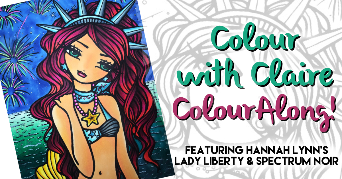
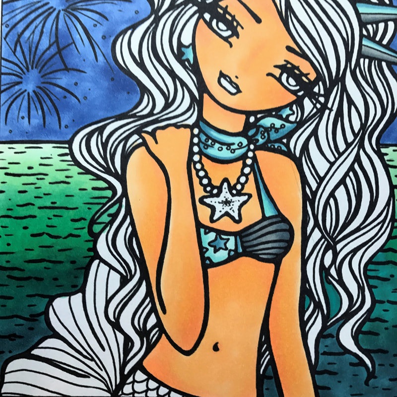
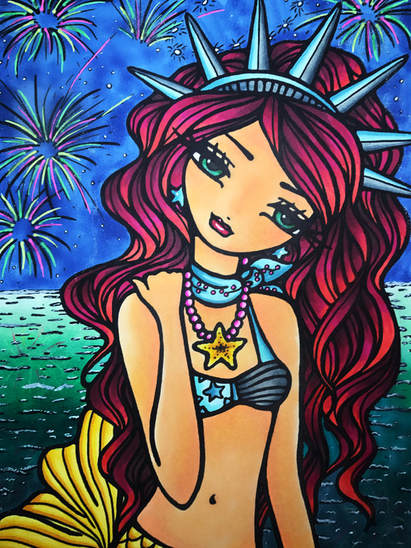
 Welcome to my step by step colouring of Lady Liberty from the book 'Mermaids, Fairies & Other Girls Of Whimsy' by Hannah Lynn. This is not technically a colouralong as I don't explain exactly how to colour the picture, but you can follow the steps if you like! I'll be explaining how I chose the colours used in this picture, plus a few tips & techniques along the way. 99% of the products I'll be using are made by Spectrum Noir as I have just become a founder for the brand and wanted to try out some of the items I have been sent. Find out more about he Founder's Campaign here. Sometimes choosing colours can be the hardest & most time consuming thing about colouring! It's difficult to know where to start and I usually end up using every colour under the rainbow on my page, which is fabulous but it means that nothing in particular stands out. Using a limited number of colours can be more effective sometimes, and so can be planning your colours carefully by using one of my favourite tools: a colour wheel. More about that later!
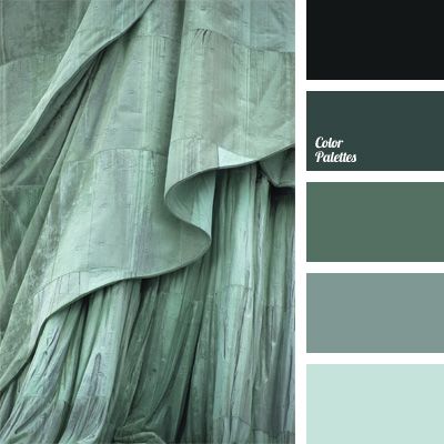
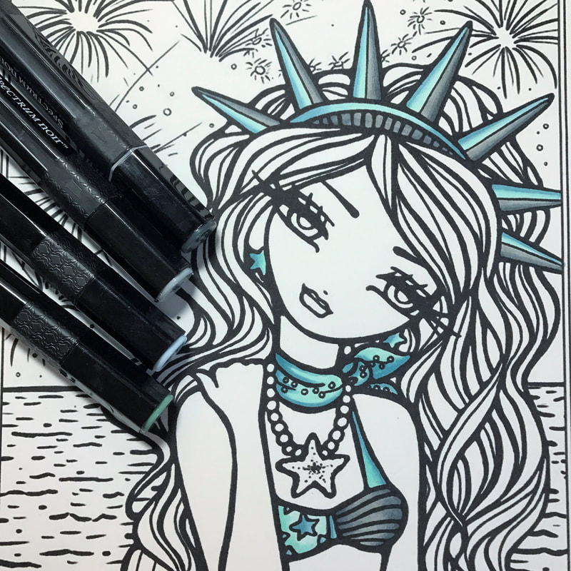
When I first looked at this page I knew I wanted the Statue of Liberty (SoL) elements to be true to life- so the very first thing I did was pull up a picture of the real thing and try to find a SoL ready-made palette online. I came across this particular one on colorpalettes.net which featured a lot of the cool teals and green greys found on the SoL. I had already decided I would be using alcohol markers for this piece, so I matched up the colours as best I could from my Spectrum Noir set of 216. The shades I selected were IB1, VB2, GG2 & GG4. I was able to give the crown a 3D 'light & shadow' look by separating the spikes into parts which faced the light and parts which didn't. I used the same 4 colours on the bikini, neckerchief and earrings to be in keeping with the SoL theme. SN alcohol markers really are a dream to use- and I'm not being biased, I have been colouring with them for years. They blend together with very little effort and give that beautiful seamless look that waterbased pens just can't achieve. Do remember that alcohol markers bleed heavily, so you need to ensure that you are using thick card or putting blotter paper behind your image so the ink doesn't transfer to the next page. If the paper in your Colouring Book isn't up to heavy media, my advice would be to scan the image and print onto better cardstock if you can. I printed this page onto Spectrum Noir Marker Card which is extremely thick (240gsm) and doesn't allow ink to creep outside the lines as most papers do.
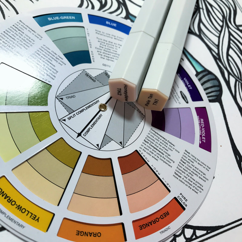
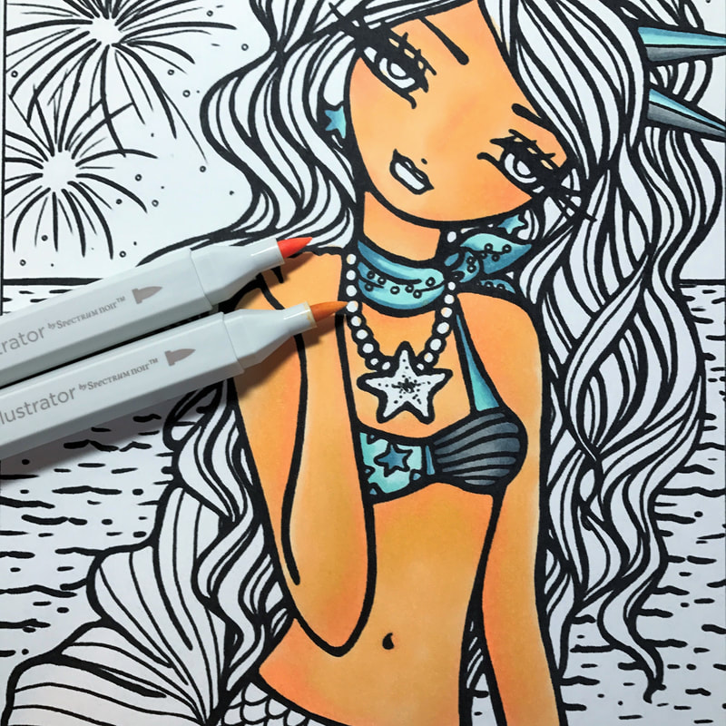
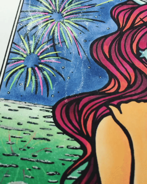
Now, here's where my colour wheel comes in. I wanted the skin to contrast with the SoL colours I had just put on, so I knew it would have to be a warm tone rather than a pale one. The back of my colour wheel shows complementary shades, tones and tints, and the one across from blue green (which was closest to the colours I'd used on the crown) was red orange. Clearly I'm not going to use reds for skin (unless you want to make it fantasy colours!), so I looked at the tint which was a warm but not bright orange/peachy colour. I selected TN1 & TN2 as the closest matches, and this time I decided to use Spectrum Noir Illustrator markers. The reason for this is that I wanted the skin to be especially smooth, and the long thick brush nib on the Illustrator pens allowed me to cover more space quickly as well as keep the application seamless. Bullet style nibs sometimes don't have the desired effect as they can only colour smaller spaces before the first layer starts to dry and you end up with an uneven look. I'm not a total pro when it comes to light sources or plotting shadows etc. To be honest, I'm pretty impulsive usually and tend to go with the flow. This is why you'll notice that the shadows, particularly on the arms, are probably not where they would realistically be on a human under those light conditions. But I'm okay with that. Oh and don't worry that the skin looks too orange! When you add more colours, this will magically tone itself down to the eye. 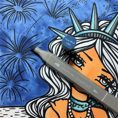 Next, the sky! I checked my colour wheel again and decided to go with a cool shade to counteract the orangey-ness of the skin. I knew it would have to be a different shade to the ocean so I kept that in mind when choosing. Obviously it had to be a night sky because of the fireworks, so a darker blue it was. With the skintone I used illustrator markers to cover a large area but still be seamless. The sky was different. This time I wanted a patchy look which would mimic both clouds and different light sources coming from the exploding lights in the sky, plus I didn't want it to take me forever as it's quite a large space. I decided to use a chisel nib which is included on the Spectrum Noir Graphic marker. Using a circular motion I was able to very quickly colour the expanse of sky whilst achieving a uneven, dappled look. I used the shade TB4.
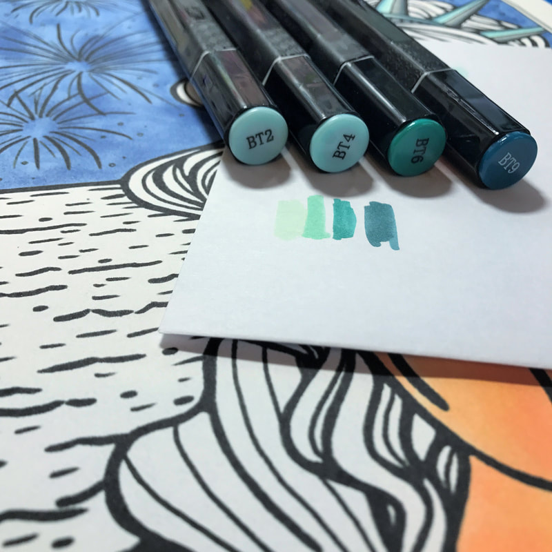
Now for the sea. All the while I'm keeping contrast in mind, so I needed colours that would be distinct against the blue I had just put down as well as give a graduated effect to indicate fireworks lighting it up. I decided on a selection of aqua tones: BT2, BT4, BT6 & BT9. Again, these shades all blend effortlessly with each other, making my job easy. I started with darkest at the bottom (furthest away from the horizon/firework light) and graduated up until it was lightest directly under the fireworks. This gives the illusion of depth and ties in with what's happening in the sky, water being highly reflective of course.
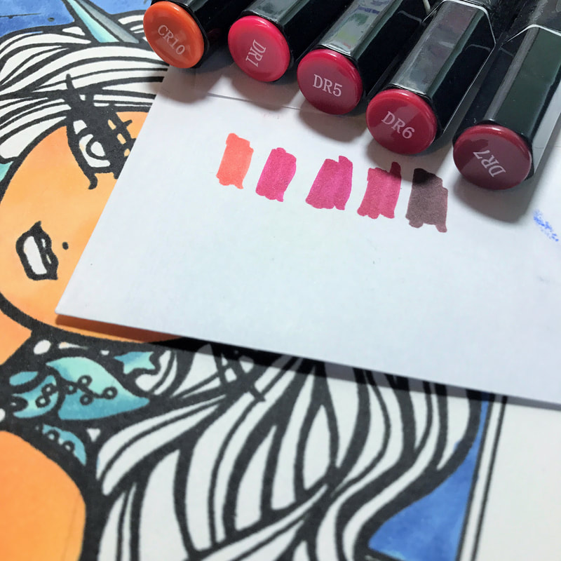
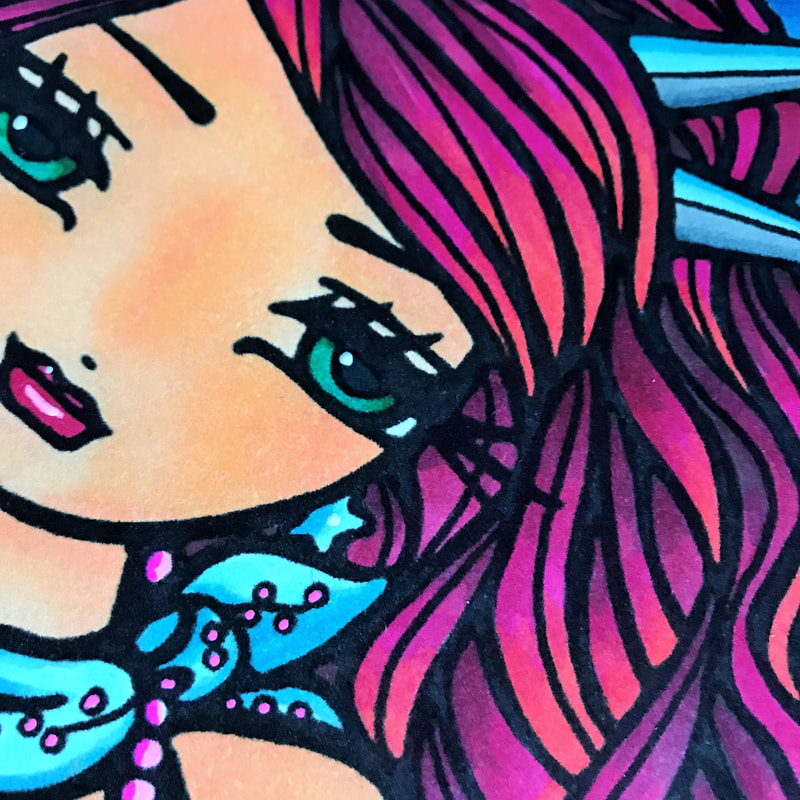
Next up, the hair! Colour wheel time again... I've used a fair amount of cool colours on the main part of this picture so it's about time I bring out the big guns and really give the eye something to focus on. It had to contrast with everything I'd done so far, so I went for a bold red. The colours I chose were CR10, DR1, DR5, DR6 & DR7, however I decided not to use DR5 in the end as it's more of a deep pink than red and didn't look right. I started at the top of every strand of hair with the DR7 and worked my way down to the tip using lighter & lighter shades. Doing it this way means you don't have to figure out where lighter waves and darker concaves of the hair need to be- simply start dark at the top and go light for each strand, it's just as effective. Again, blends were effortless. 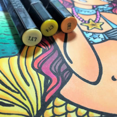 Then I had to figure out what colour to do the mermaid's tail. I would've liked to have continued with the SoL colours but they would have been lost in the aqua ocean. I didn't want to use orange as there's already more than enough on the skin, so I went for a lemon yellow to contrast against the green, with a darker yellow/light orange just for shadows & detail. The colours I used were LY1, CT4 & OR1.
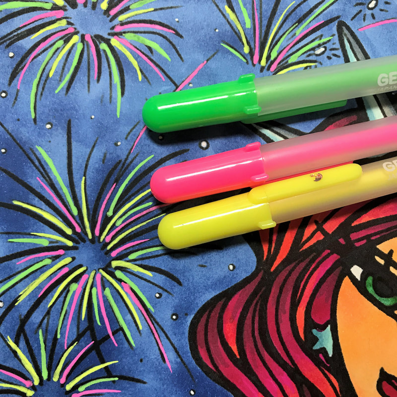
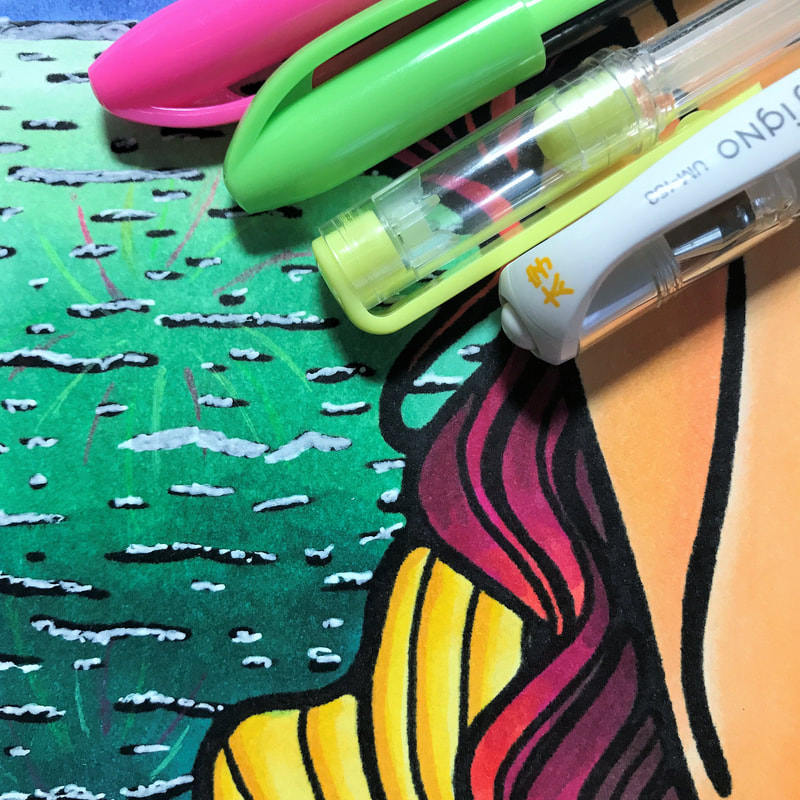
Now the fireworks! I needed something to really stand out against that dark sky, and alcohol markers just wouldn't cut it. So I turned to my brightest and most opaque gel pens: Moonlight Gelly Roll. These pens have such thick coverage and super bright colours, so they were ideal for fireworks. Again I didn't want to use orange so I stuck with neon pink, green & yellow. The next part is something I'm not too happy with but it's done now so que sera! I used cheaper gel pens which weren't nearly so opaque to give the impression of reflected fireworks in the water, as I wanted colours that were similar but not as saturated as they were in the sky. This didn't turn out great, but hey ho. I decided to fluff up the waves a bit by adding white gel pen ruffles here & there, but again I'm not sure how well that works.
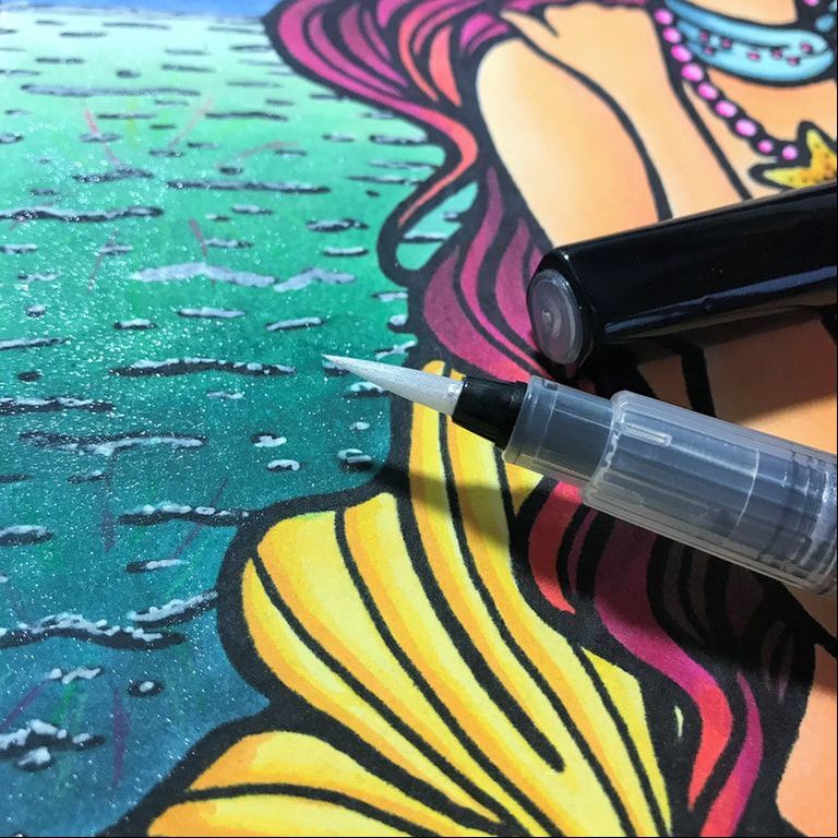
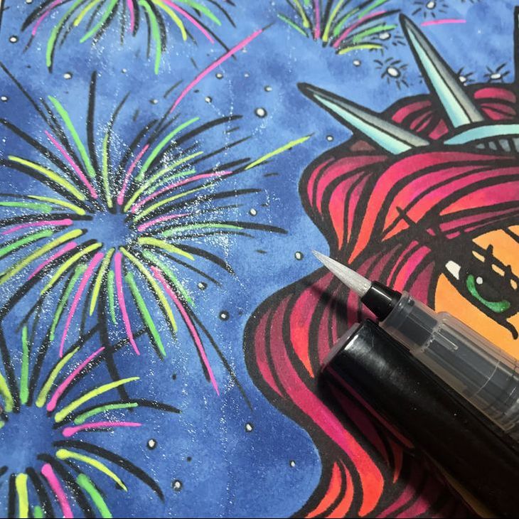
After that fail I was determined to make the ocean really sparkle with all the lights going off above it, so I took a Spectrum Noir Sparkle pen in Crystal Clear and covered the whole sea with fine glitter. I then added it to the fireworks and let some glitter drizzle down to the ocean, creating lines of shimmer reminiscent of twinkles & sparks falling from the sky.
At last, after adding a few white highlights here & there, she was finished! In total I spent 2-3 hours on this piece. A few people who have already seen the picture couldn't believe I had done it so quickly because the blends are really on point, but it truly is down to the markers and I'm not just saying that! Would you believe that originally I coloured the mermaid's eyes dark brown?! You can literally erase and replace colours with these markers, something waterbased pens could never do! And even though I used tonnes of layers and pressure, there was zero bleed-through on this paper and no seeping out of the lines. Alcohol ink is fantastic no matter what brand you use to be fair, but the difference with Spectrum Noir is the diversity of nibs for different uses and of course the super simple coding system that allows you to find colours that work together, quicker. Not to mention, they're LOADS cheaper than Copic & work just as well. I really hope you've enjoyed this walk through of my colouring & I'd love to hear from you so please do leave a comment either here or on Facebook!
3 Comments
Pamela Duarte
20/7/2017 08:41:11 pm
Great job Claire!
Connie O'Keefe Edwards
21/7/2017 10:18:25 am
Wonderful "color-along". Learned nbit of everythung re:Spectrum Noir markers types, blendjng, and more.
Rosa
21/10/2017 09:59:38 am
As a native New Yorker, I think it's beautiful. Thank you for. shari ng. Your comment will be posted after it is approved.
Leave a Reply. |


 RSS Feed