Summary
Current Price: £13.46 Number of Pages: 20 Size: 33 x 25cm Paper colour: Ivory Paper surface: Smooth Paper thickness: Very Good - Card Linework: Fine/Medium Perforated: No - Pull Out Pages One sided: Yes Binding: Lay Flat Drawings go into the spine: No Waterbased pen bleed: None
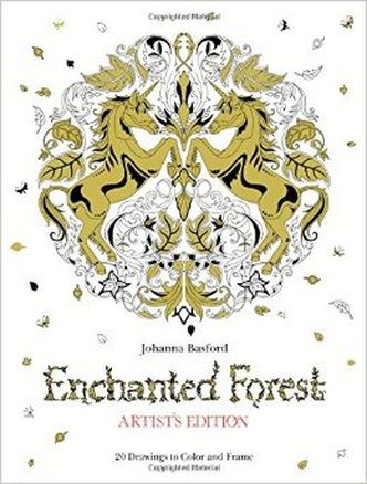
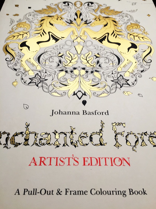
Whenever I check into the Facebook colouring groups and see the question 'What's your favourite Johanna Basford book?' the answer is almost always Enchanted Forest. Another thing I hear is the lament 'I wish her books were one sided!' which means this new release will be on a LOT of people's wish lists. Enchanted Forest: Artist's Edition was released here in the UK today, so I can give you a full look inside and the link for you to get your hands on a copy!
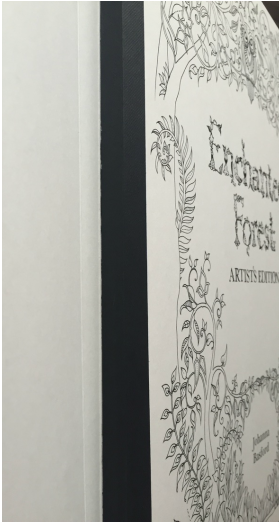
If you haven't heard of the Artist Edition's before, let me give you a lowdown on how these books differ from the original books. JB's Artist Editions feature 20 of her favourite illustrations from the book, on a large scale format with super-thick card pages that can be easily pulled out from the special lay flat binding to display. Of course, each page is one sided so you're able to use ANY medium to colour- the cardstock is unmatched in thickness and quality so even watercolour paints wouldn't make a wrinkle in them. This is the perfect compromise for people who love Johanna's artwork but are limited by the double-sided set up. Last year, Johanna released Secret Garden: Artist's Edition, which is exactly the same size and format.
The images are a mixture of standalone pieces and double-page spreads, although the latter have been shrunk and rotated to fit onto one side of card rather than two pages. EF has some beautiful spreads which I would've liked to have seen more of in the Artist's Edition. Images like the dragonfly and the animal pyramid look a little lost in the centre of the vast pages, so I'm not sure the space was used to its maximum potential. That said, you could always trim down the page when framing so the illustration commands the space. The leafy fox has been blown up to fit the frame of the page, making the linework appear bolder than it was originally- quite a stark contrast to JB's usually pin-thin lines. Take a look through the whole book in my slideshow below.
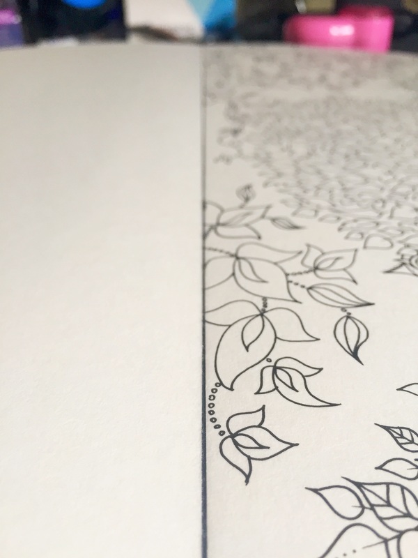
The cardstock is ivory which is generally the colourist's favourite when it comes to Johanna's books, giving them a classic, vintage look. There's lots of tooth to layer up those pencils and create deep blends, and the linework is still as intricate as ever so tiny details are not lost in this book.
As I mentioned I would have loved some of the other images to be included, ones that perhaps would've been more fitting to the page layout, but overall I'm more than pleased to have another beautiful Artist's Edition in my hands. I'm VERY inrigued to see Lost Ocean in this format as the details in that book are so intricate- hopefully they will be a little easier to colour! Here is a picture I completed using Prismacolor pencils, a white gel pen and a black marker. 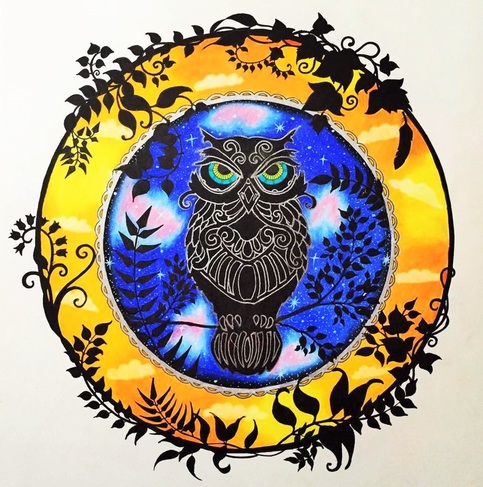
I received this book in exchange for an honest review. You can find it on Amazon here:
1 Comment
30/3/2016 03:10:09 pm
Love it! Didn't know about the pull out and frame versions til I read this - got both in post today and very impressed. Would love to see some more finished images so I can compare and see if mine are actually any good. Your comment will be posted after it is approved.
Leave a Reply. |


 RSS Feed