|
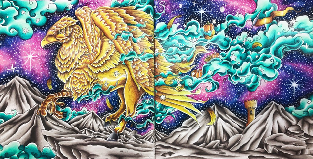
Double page spreads always scared me but I’ve recently come to appreciate just how incredible these big scenes with full backgrounds look! I knew that you all wanted more background tutorials, so my Neocolor II Galaxy Tutorial was born on this page. Me being me, I couldn’t just leave it at that. I have to finish every page I start before I can move on, so I took a deep breath and dove in!
I knew I had to make the hippogriff and smoke- the main elements on the page- stand out from all that colour in the background. I could’ve used reds, but all the pinks and purples in the background wouldn't have provided enough contrast. I decided to go with green, but not just any basic green. I wanted a deep aqua that was definitely more on the green side than the blue, as we already put down lots of blue in the galaxy. I decided to use Prismacolor pencils and the colours I chose were Peacock Green, Parrot Green and Light Green. I worked from dark to light in the individual swirls of smoke, using Kerby’s shading to help place the colours. My one big colouring tip which I talk about all the time is to leave some white on everything. You may not realise, but most of the pictures you’re absolutely blown away by stand out because of the white left on the page. It’s - combination of very dark shadows and white that makes the colours pop! So I made sure that every plume of smoke had white left at the edges- I even went over the very edge with white gel pen to really maximise that contrast. Next up, Mr Hippogriff himself. Again, I wanted colours that would stand out against the busy background, so I looked to the Colour Wheel. There’s tonnes of purple and pink in the galaxy, so I hopped across the wheel to the opposite colour- yellow. I didn’t just want a basic yellow griffin though- it had to have depth and dimension. Gold tones are quite easy to create with Prismas, just look for deep yellows and golden browns. The darker brown really deepens that contrast (sorry I keep going on about it but contrast is a massive part of my colouring!). So I picked out my combination of three light/med/dark tones: Lemon Yellow, Sunburst Yellow & Goldenrod. I then chose a fourth colour, Burnt Sienna, to make the shadow areas even darker. Again I wanted to leave lots of white, working from dark to light on each individual feather, just as I did on the smoke. I used a bit more Burnt Sienna on the legs to separate them from the rest of the body, but I’m not 100% happy with how the entire hippogriff is all the same colours- I think I should’ve concentrated on making his body look different to his wings. Finally I had to think about the mountainous rocks on the bottom of the page. I thought about brown, but we had lots of that in the griffin. I considered burnt pinks like Henna, but I thought there was already too much pink on that galaxy. I wanted every single element to stand out from each other. I turned to the colours I use when I just don’t know what to do- French Greys. These are my go-to colours for rock/stone when I don’t want to use regular greys or browns. I selected French Grey 10%, 30% & 70% (I always try to stick to 3 colours) and of course, decided to leave the white areas again. By applying the darkest of the greys against Kerby’s lines first then blending out gradually with the other greys, I was able to gauge how much of each colour to put down to still leave room for the white. I added the final little bits of detail in the smoke and thank goodness I was DONE! It wasn’t actually too laborious and I quite enjoyed it truth be told. I just finished a big double piece in The Beauty of Horror a week before, and alongside this one I’ve felt a greater sense of achievement than I would when colouring one page with no background. I think I’m converted to double page spreads!
4 Comments
Rhianon
9/6/2018 02:57:00 pm
I loved reading this write up on how you made all the choices you made. Looks great, thank you!
Reply
Mary Ann Taylor
10/6/2018 12:04:17 am
So many great tips and I love the over all effect. Thanks for writing out how you made your decisions and listing out the colors. I might just get brave enough to try a double page. 😊
Reply
Brandie
10/6/2018 04:32:43 am
Your coloring always mesmerizes me.. Your very dedicated to each and every page. Thank you so much for your tips and knowledge..
Reply
Karen Dorland
17/6/2018 04:08:55 pm
Thank you Claire, very much appreciate your help in selecting colours, your work is very inspiring!
Reply
Your comment will be posted after it is approved.
Leave a Reply. |
- ~Home~
- ~My Story~
- ~Mental Health~
- ~My Illustrations~
- ~Beginner's Guide to Colouring~
- ~Tutorials~
- ~Colouring Book Reviews~
- ~Product Reviews~
- ~Arts & Crafts Reviews~
- ~Charts~
- ~Gallery~
- ~Colouring Challenges~
- ~Gemstones~
- ~The Color Catalog~
- ~Illustrator Interviews~
- ~Media Appearances~
- ~FAQ~
- ~Contact~
- ~Policy~
©Claire Eadie 2015


 RSS Feed
