|
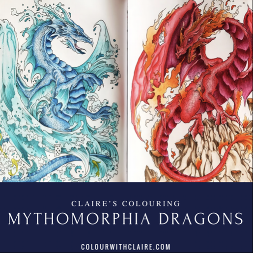
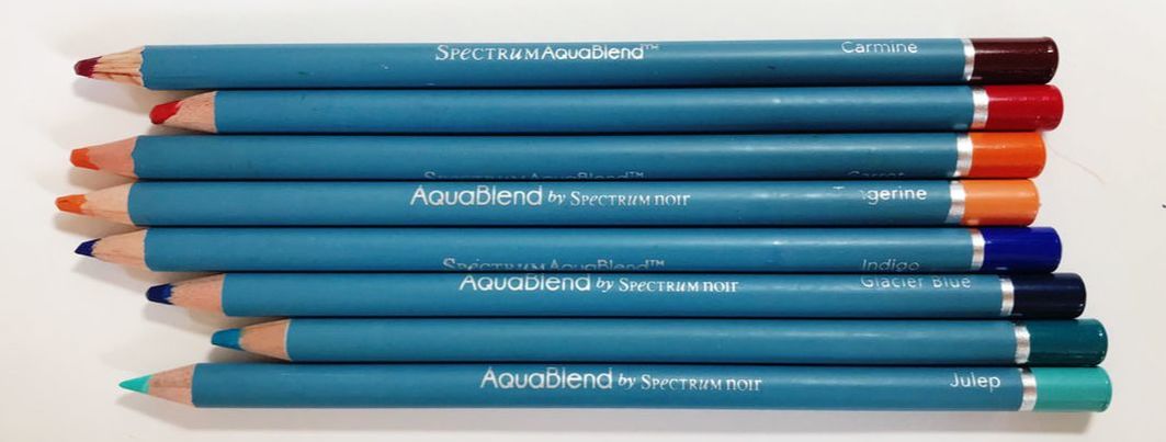
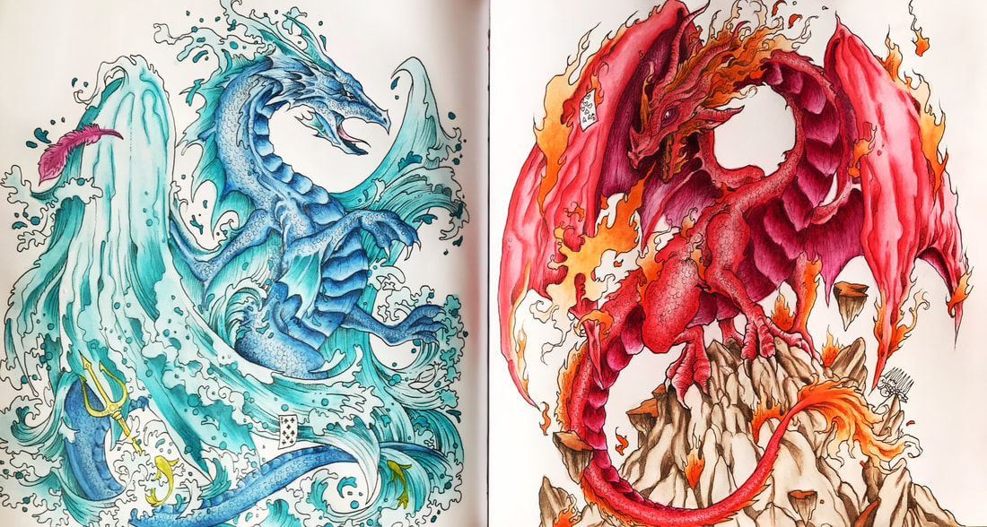
Here's the first post in a new series I'm starting whereby I show you what I've been colouring lately and explain how I did it! I usually just post the picture on Facebook to show you but I always get lots of questions about what I used so I thought- why not blog about it?! This is two singular images (from Mythomorphia by Kerby Rosanes) that sort of make a double spread as they're both dragons obviously. Often when there are opposing pictures with the same theme I like to make them yin & yang with each other rather than match. For the water dragon I kept all my tones cool with blues and aquas, blending out into white to give the look of frothing waves. With the fire dragon I of course used lots of hot reds and oranges. I decided to use Spectrum Noir Aquablend Pencils on this project, mainly because I wanted to create a blended look without having to do too much work, but also because I haven't had the chance to put them to the test yet. As you can tell they are no disappointment when it comes to vibrancy! I was actually shocked by the sheer intensity of the colours, something I've only seen in Derwent Inktense, which are of course made from ink not watercolour pigment. Certainly no other watercolour pencils I've used come close to the vividness of the colour and how soft & easy it they are to lay onto the paper. You can keep going in with water and reactivating the colour you've put down as well as layering more on top to boost the colour in certain areas. The colours I used were:
Water Dragon - Julep, Lagoon, Indigo, Glacier Blue. Fire Dragon- Red Berry, Carmine, Carrot, Tangerine. I'm still not sure whether to give the dragons a background- and if so, what? Let me know what you guys think! I hope you've enjoyed reading about my colouring process and if this is something you would like me to do with all my finished pieces, let me know that too!
8 Comments
Wendy
10/8/2017 05:41:37 pm
Brilliant idea for a series Claire, or actually, every time you finish something?! With regard to a background, personally I would quit while you're ahead, they look amazing so leave them as they are. I'm never sure about using watercolour pencils in colouring books; don't the pages bubble up? Doesn't it affect the picture on the other side?
Reply
Claire
10/8/2017 09:22:58 pm
Thanks Wendy, yes I’m planning on blogging about everything I Colour from now on :) I agree that I should probably leave it alone, I was considering a black background but I don’t think it will be as effective x
Reply
Rhianon
10/8/2017 06:55:21 pm
Since you're doing yin & yang, red background for the blue dragon, blue for the red! :)
Reply
Claire
10/8/2017 09:24:00 pm
Great idea Rhiannon, I think I may leave it white this time... then again, I might change my mind! 😅
Reply
Mary Baker
10/8/2017 09:29:40 pm
Would you please let me know what set you did these with? Thanks!
Reply
Claire
10/8/2017 09:33:44 pm
Hi Mary, I have all the sets of Aquablend pencils mixed in a pencil pot so I couldn’t tell you which sets these pencils are from :( I’ll try & find out online x
Reply
Mary Baker
10/8/2017 10:01:28 pm
Ty! I looked but couldn't find anywhere that had what colors are in the sets....:)
Denise
11/8/2017 04:15:22 am
Claire, I love what you've done with both pages, it's stunning and I truly can relate to the background question and mostly I leave the background white because I fear I'll ruin the whole page. In this case however I would go for a background inspired by stormy clouds on the left side and for the right side clouds illuminated by a fiery sunset.
Reply
Your comment will be posted after it is approved.
Leave a Reply. |
- ~Home~
- ~My Story~
- ~Mental Health~
- ~My Illustrations~
- ~Beginner's Guide to Colouring~
- ~Tutorials~
- ~Colouring Book Reviews~
- ~Product Reviews~
- ~Arts & Crafts Reviews~
- ~Charts~
- ~Gallery~
- ~Colouring Challenges~
- ~Gemstones~
- ~The Color Catalog~
- ~Illustrator Interviews~
- ~Media Appearances~
- ~FAQ~
- ~Contact~
- ~Policy~
©Claire Eadie 2015


 RSS Feed
